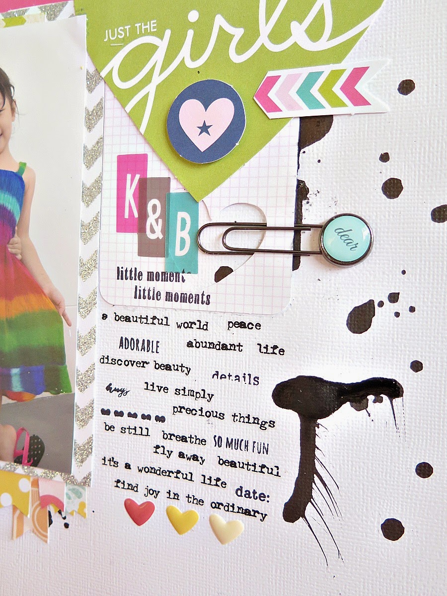
This was my intepretation of the sketch and some close ups...
Products used:
Patterened Papers : Echo Park, Bella Blvd, American Crafts
Embellishments : Prima, Bella Blvd, Tim Holz and October Afternoon
I kept the arrangement of the sketch closely. What inspired me were the banners below the photo. I simply made use of a variety of patterned papers and hand cut little banners. No accurate cutting was done, for sure. Once done, layer according to your preference and ensure that all parts are overlapped.
The use of bright colours in the layout called for a balance of more neutral colours like black and white. That is my solution whenever I work with bolder colours. Lately, I have been crazy about rub ons, especially the ones by Tim Holtz. I simply cut a chunk of them out and use them for my journaling. In this case, I mixed the rub ons with some stamp sentiments.
I hope you enjoyed this post. Be sure to check out the other designers' blog in the upcoming weeks.
Have a great week ahead.


No comments:
Post a Comment